Trading Activity - Overview
The FXSSI Trading Activity Tool presents data on market changes within a 20-minute timeframe. It generates two distinct charts, each illustrating the increase or decrease in the volume of Sell and Buy trades within the Forex market.
This information is mainly used to understand market dynamics and to distinguish which group of traders, sellers or buyers, were more active during a specific period. It helps in predicting whether a trend will continue or reverse.
Additional articles you should read before you start trading with Trading Activity tool:
- Order Book Guide – (Series of five articles);
- Sentiment Strategy: Beginner’s Guide;
- Stereotypes of the Market Crowd Behavior.
How to Read Trading Activity charts
This tool offers a set of data for you to analyze:
- Increase/Decrease charts,
- Delta charts.
Let’s take a closer look at each one.
Increase/Decrease Charts
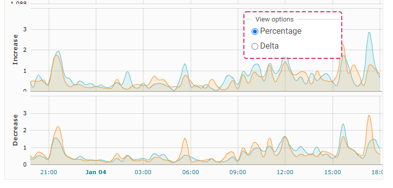
- Increased Blue Line: The percentage of traders who entered the market with a Buy trade.
- Increase Orange Line: The percentage of traders who entered the market with a Sell trade.
- Decrease Blue Line: The percentage of traders who closed their Buy trades.
- Decrease Orange Line: The percentage of traders who closed their Sell trades.
Primarily, you should concentrate on scenarios where one group of traders, either buyers or sellers, prevails in the indicator’s readings, or when there are significant spikes for both groups compared to their previous activity.
Delta Charts
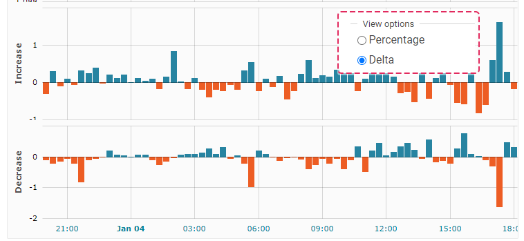
These charts show the difference in activity between Buyers and Sellers. Simply put, it’s the blue line subtracted from the orange line, as described in the earlier section of this article.
- Increase Blue Bar: In the past period, more Buyers entered the market.
- Increase Orange Bar: In the last period, more Sellers entered the market.
- Decrease Blue Bar: In the past period, more Buyers exited the market.
- Decrease Orange Bar: In the last period, more Sellers exited the market.
These charts can be used to easily see which group of traders, buyers or sellers, was more active.
Trading Activity Interface
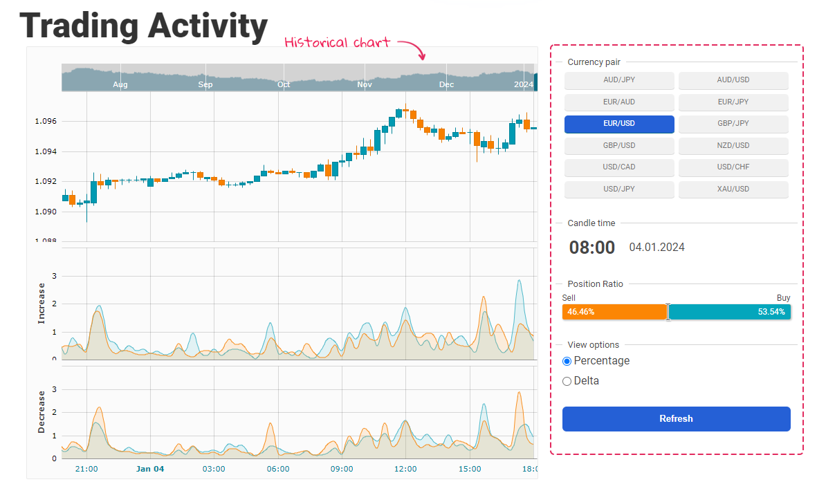
Historical Chart. There is a small chart above the main chart that allows you to navigate through historical data for up to 6 months.
Currency Pairs. Here is the list of available currency pairs for this tool:
- AUD/JPY;
- AUD/USD;
- EUR/AUD;
- EUR/JPY;
- EUR/USD;
- GBP/JPY;
- GBP/USD;
- NZD/USD;
- USD/CAD;
- USD/CHF;
- USD/JPY;
- XAU/USD;
Snapshots time. Displays the time at which the current snapshot of the data was taken. If you hover your mouse over the chart, this time display will update to show when the snapshot for that specific candlestick, the one under your cursor, was created.
Open Positions Ratio. Ratio of Buy to Sell Trades for a Chosen Candle.
View Options. Several toggles for enabling and disabling features such as the Percentage and Delta.
The “Refresh” button on this tool refreshes the data, providing you with the latest information for Trading Activity indicator.
The Trading Activity Tool visualizes market changes in 20-minute intervals through charts that show the increase or decrease in Forex Buy and Sell trade volumes. It allows for analysis of which trader group, buyers or sellers, is more active in specific periods and provides indicators for predicting market trend changes.


