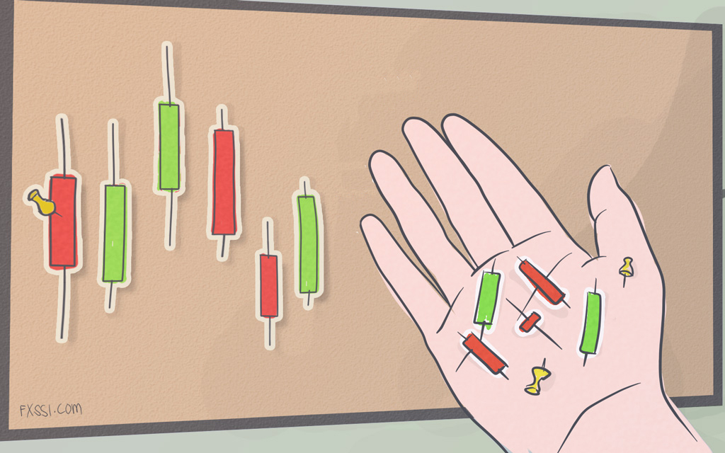
Footprint Chart. Simple Footprint Patterns
Our journey began with Forex, like many others. In our search for profits, we came to the futures market, and our basic analysis tool was the footprint. We’re going to tell you about it in this article.


We access the footprint with the ATAS platform.
Scientifically speaking, the footprint chart is an aggregated tape of orders. Individual orders of market participants are processed and distributed within each candlestick based on price and volume.
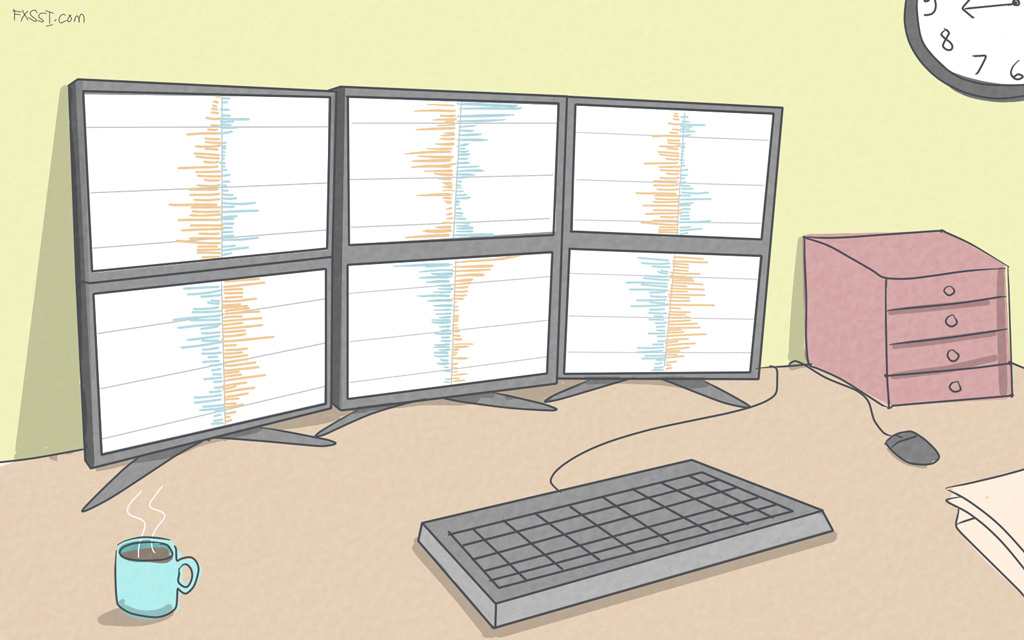
When considering the Forex footprint chart mt4, you’ll observe rectangles of different lengths: this is so-called horizontal volume profile. The length of stripes depends on the number of contracts traded at the given price.
You may also notice two columns showing numbers. The left-side column displays the number of Sell trades, and the right-side column displays the number of Buy trades.
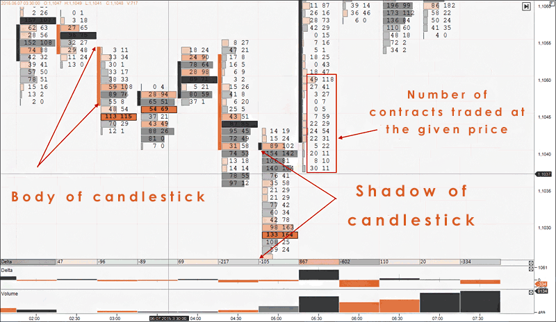
As a result, 3D effect is added to a candlestick: the struggle of buyers and sellers can be seen with the naked eye.
The differences between this chart and classic candlestick chart are clearly visible in the two pictures below.
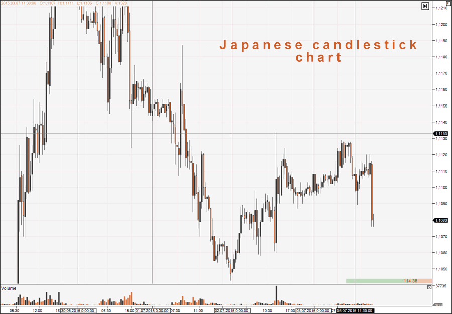
The first picture illustrates the Japanese candlestick chart with no footprint. Using this chart, a trader can analyze the amount that price moves, apply levels, and also identify the points, where the current movement stops, by the shadows of candlesticks.
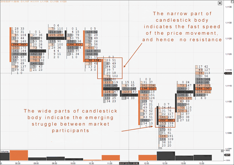
However, when you add volumes to the chart, the picture changes dramatically, and the chart becomes more informative.
Now a trader can spot areas where buyers and sellers are struggling, as well as track the movement of these areas. This enables a more accurate determination of what’s exactly happening in the market.
Let’s consider two footprint patterns and possible decisions made by a trader as soon as they occur as an example.
Simple Footprint Patterns
Btw, if you are looking to upgrade your terminal with pro indicators and different utilities you can browse from variety of resources available at FXSSI Product manager.
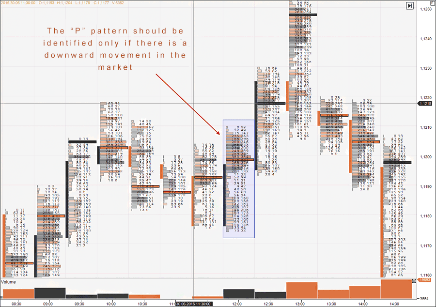
The first pattern looks like the Latin letter “P”, so it’s called the “P” pattern. It’s characterized by a narrow body in the lower half and a wide body in the upper half of candlestick; the candlestick is rising and has no wide shadows.
This pattern tells a trader that sellers are exiting their positions. It should be considered only if there has been a downward movement before its formation.
If the “P” pattern appears in the sideways market or when the price is rising, it’s not used.
The second pattern resembles the Latin letter “B”, so it’s called similarly – the “B” pattern. It’s characterized by a narrow body in the upper half and a wide body in the lower half of candlestick; the candlestick is falling.
This pattern indicates that buyers are exiting their positions. If it occurs after the uptrend phase, it tells a trader about the end of the current movement.
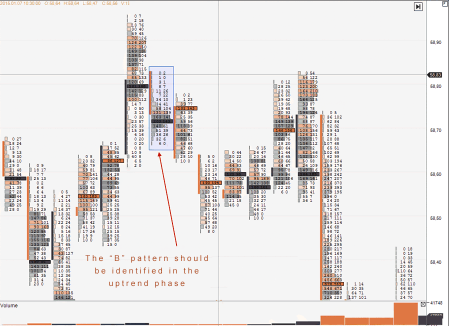
The “B” pattern should be identified in the uptrend phase.
Delta Chart
We would also like to introduce you to our second Forex tool.
It’s not always convenient to analyze the footprint with Japanese candlesticks only, since they have own disadvantages, namely: candlesticks distort the market picture in the periods of low volatility. This is why we often use another type of chart – Delta chart – instead of candlesticks.
Before we show you the chart itself, we should tell you what the Delta is.
Delta is the difference between the number of market Buy orders and market Sell orders. Delta is an indicator, but it has nothing to do with technical analysis.
The Delta chart is constructed based on the value of this difference. We usually use the value of 300 contracts. It means that a new falling or rising candlestick will be formed when the difference between Buy and Sell trades amounts to 300 contracts.
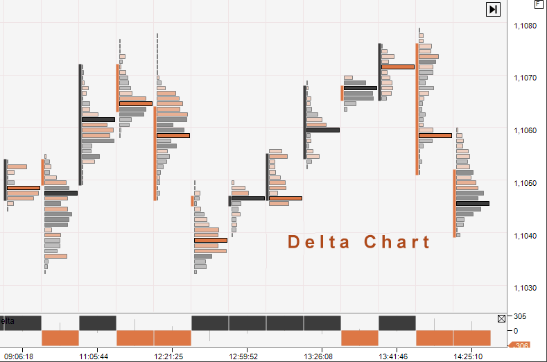
You can see the chart constructed using the Delta in the picture above. It perfectly filters out the market noise occurring in the periods of low activity of market participants.
In addition, candlesticks have small bodies on such a chart, and a wide shadow is uncommon for the Delta chart.
However, the main advantage of the Delta chart is the “Signal” footprint pattern. That’s what we call the pattern used to make a trade. You can see the example of this pattern in the picture below.
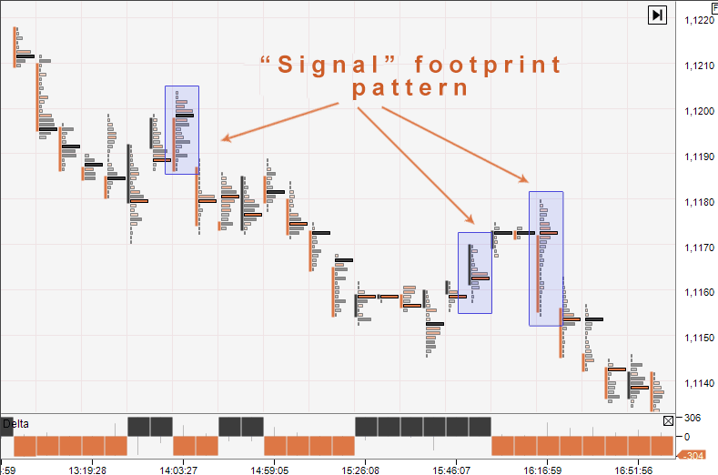
The “Signal” is formed as follows: Sell trade should be made, if a candlestick is falling and have no a lower shadow. The maximum trading volume should be in the upper half, but rather in the upper third of a candlestick. The rest of the candlestick should be narrow.
The exact opposite is true for Buy trades: these trades should be made if a candlestick is falling, the maximum trading volume is in the lower half of the candlestick, and the candlestick body itself is narrow.
As you can see, the footprint chart has the enormous opportunities for making market analysis and identifying entry/exit points. It’s equally useful for those who prefer intraday and position trading.