Bar vs Candlestick vs Line charts — Which Chart is the Best for Trading Forex?
A Forex chart is a kind of a window that gives us a glimpse of the forex market. It is often represented in the form of a graph, with the price displayed on the right side and the time shown at the bottom.

You could call it a graph of price against time. But the way the prices in the graph are displayed greatly affects how we interpret the forex market. We call these display methods chart types. And the three most common chart types are:
- The line chart.
- The bar chart.
- The candlestick chart.

But which one of these three types is the best one for forex trading? Before we answer this question though, let’s get you up to speed on what each of these charts represents.
The Line Chart
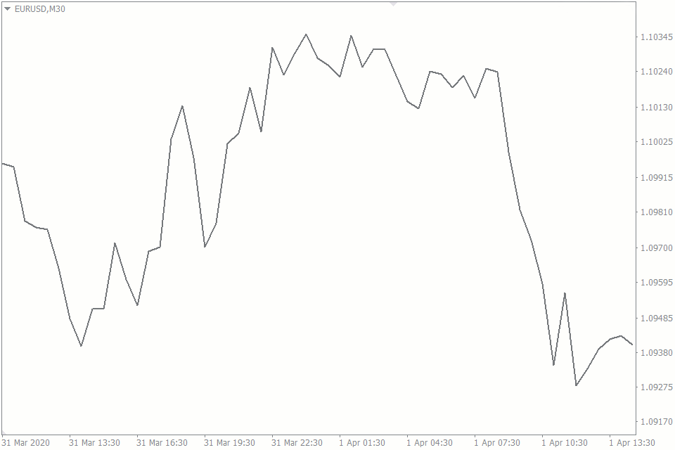
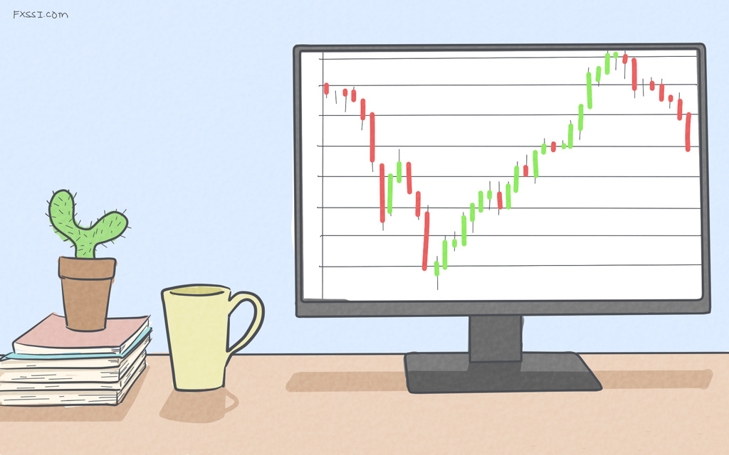
The line chart is the simplest of all the above mentioned types. It is most similar to the graphs we plotted in elementary mathematics, where we only had to connect different points. And in forex, the points we connect are the closing prices for each time period.
Because of its simplicity, the line chart offers a quick method of visualizing the direction of the price without being overwhelmed with information.
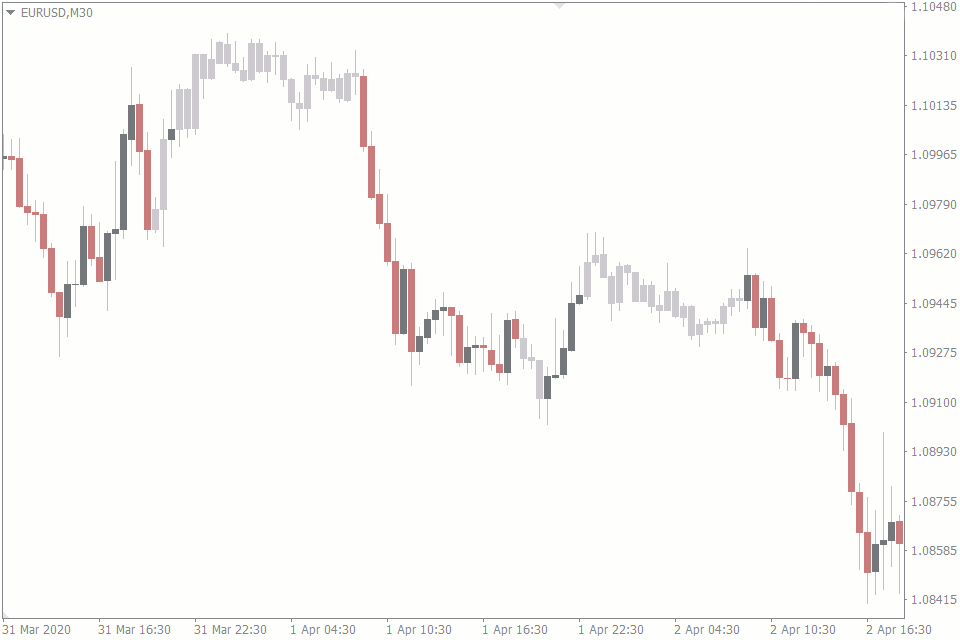
The Candlestick Chart
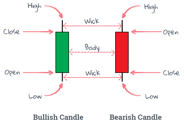
The Japanese candlestick chart offers more details than the line chart. Every single candle represents four things: the opening and closing prices of a certain time period, the highest and lowest price levels within the same period.
The body of a candle tells the open and close prices, while the wicks represent the high and low prices. Besides those four pieces of information, the candlestick uses colors to tell if the price closed above or below its opening level.
Back in the day, before we used colored prints for printing out charts, all we had was black and white.
So, the bullish candlestick, where the price closed above the opening price, was displayed in white. And the bearish candlestick, where the price closed below the opening price, was done in black.
But today, we have the luxury of changing the colors to whatever we want. And the most common colors are green for bullish candles and red for bearish ones.
The Bar Chart
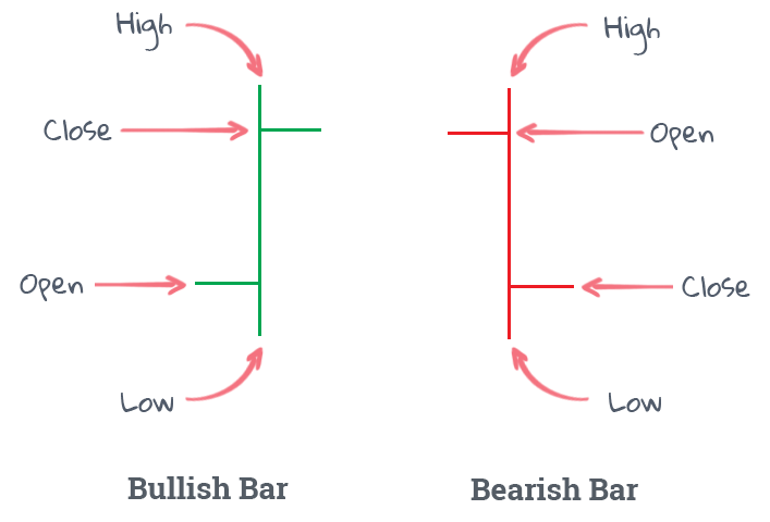
The bar chart is very similar to the candlestick chart because the data they display are almost the same. They both depict open, close, high, and low prices. But there are slight differences.
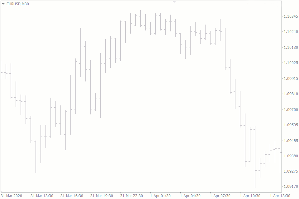
The most obvious difference is the look of the bar chart itself. Bar charts have vertical lines with short horizontal lines protruding from either side. The line protruding from the left side represents the opening price, and the one on the right depicts the closing price.
Chart Types Comparison: Line Vs Bar Vs Candlestick
Let’s take a closer look at the differences between the three chart types, even though the sharpest contrast is mostly between the bar and the candlestick charts.
Line Chart Vs Bar and Candlestick Charts
Here are the ways the line chart differs from the bar and candlestick ones:
- Nothing trumps the line chart when it comes to simplicity. The bar and candlestick charts have more information embedded within each bar or candle, making them quite overwhelming to study. As a result, the line chart can be easier for beginners, who don't want to drown in the vast amount of data.
- The line chart is best for higher time frame charts, since it gives the trader only a sense of the price direction and not the finer details of open and close levels.
- The lack of sophistication of the line chart makes it weaker compared to advanced technical analysis. For instance, the bar and candlestick charts can give you more precise insights into where to place your stop loss and take profit levels. This explains why line charts are rarely used by traders, who trade anything from the weekly chart downward.
- The bar and candlestick charts can help to tell the volume of the market with their heights but the line chart can’t. In fact, there are powerful candlestick trading patterns that would be impossible if there was no way for the candlesticks or the bar charts to display volume.
Bar vs Candlestick Charts
The differences between the bar and the candlestick charts are rather minor and sometimes even negligible.
- When considering the opening price of a certain time period, the bar chart places more emphasis on the closing price of the previous period than the actual opening price of a given period. The candlestick chart, on the other hand, uses the actual opening price of a certain time period. This difference is negligible because 9 times out of 10, the opening price of a particular period is the same as the closing price of the previous one.
- More forex candlestick trading patterns stem rather from candlestick charts than from the bar charts. You can also use bar charts for the patterns of course. However, candlestick charts are preferred, since the patterns were developed specifically based on them.
- The bar chart might provide you with slightly better precision when drawing trendlines and zones on the chart. The reason is that the bar charts are basically just lines. The candlesticks, on the other hand, have bodies that take up more space and reduce precision. And though this difference might be negligible, some professional traders claim it has helped them make better trading decisions.
Which Chart Type is Best for Forex Trading?
We’ll leave it up to you to decide what chart is best for you.
Although they both depict the same open-close-high-low information, the candlestick chart is the most popular by far. The reason is that there are a lot of trading tools, formations, and strategies that stem from the candlestick.
Another possible reason for the popularity of the candlestick chart is that the colors on them make it easy to tell the bullish or bearish direction of the price at a cursory glance.