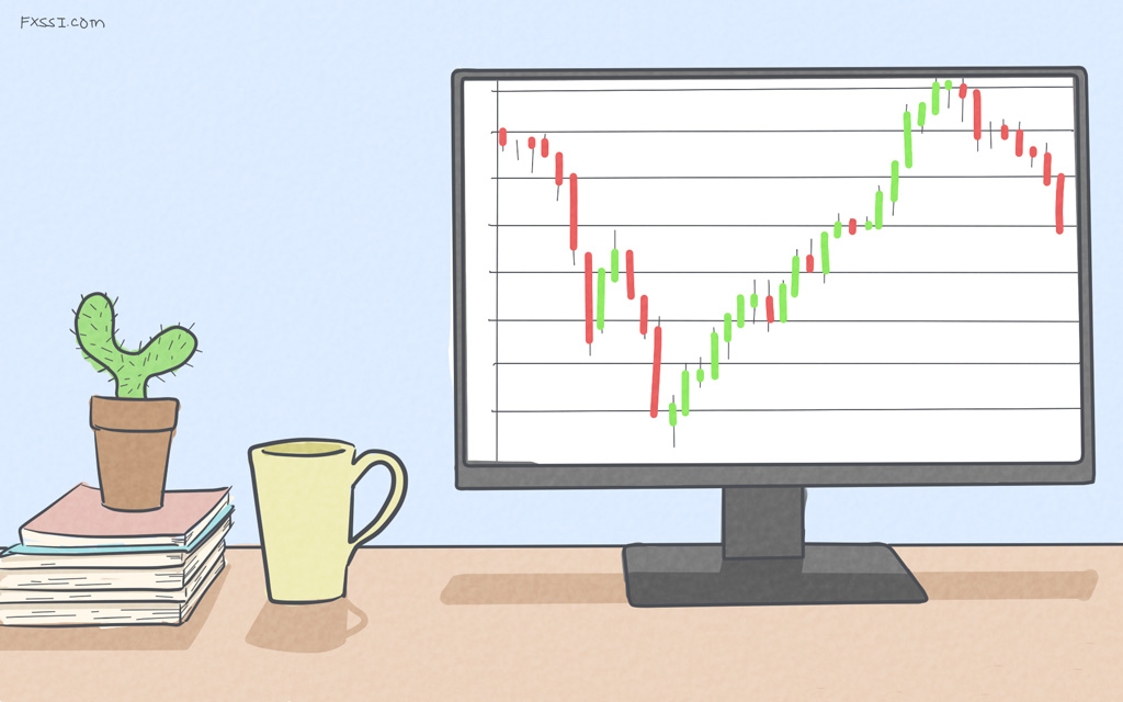
Heikin Ashi Chart Explained - How It’s Different From the Normal Japanese Chart
Do the unending ups and downs of the Japanese candles, even in an obvious trend, creep you out? Perhaps, the Heikin-Ashi candles would work better for you.

A peculiarity of the traditional Japanese candles is that they show you the price as it is, which is a good thing. You can tell exactly how much the price has changed within a period, and you can base your analysis on that.
But the slight issue with traditional Japanese candles is that their brutal honesty can sometimes be overwhelming and confusing. For instance, there are just as many bullish candlesticks in the chart below as there are bearish ones on the minor trends.
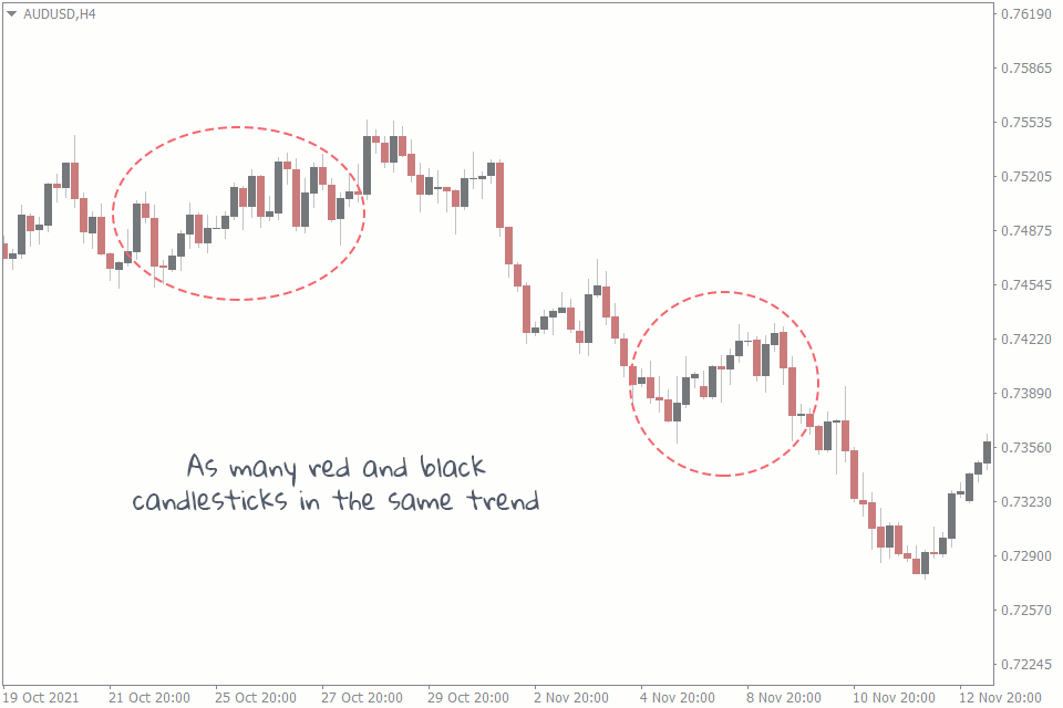
To make things a little more complicated, the candlestick patterns are all over the place. There are bullish candlestick patterns in a clearly bullish trend next to their bearish counterparts. Novice traders may get confused about what signals to follow.
And for the most part, this is the problem Heikin Ashi candles solve.
What Is the Heikin Ashi Chart?
The Heikin Ashi is a financial market chart that uses candlesticks to denote price movements. And because of the way the values of the candlesticks are calculated, the Heikin Ashi appears to give smoother charts with green candles following one another on an uptrend and red candles queuing in a downtrend.
By the way, the Heikin Ashi and the normal candlestick chart both have Japanese origins. But for the sake of simplicity, we refer to the normal one as Japanese charts and the Heikin Ashi as is.
How the Heikin Ashi Is Calculated
Unlike the Japanese candlesticks, Heikin Ashi relies not only on the price movements of the current period. Instead, it uses the price data from previous and current periods.
But the Heikin Ashi is like Japanese candlesticks in that they both have bodies and wicks that extend from either vertical end of the bodies. This means they both have open, close, high, and low prices.
Here’s how these four parts of the Heikin Ashi candlesticks are calculated:
Open: (Previous Candlestick Open + Previous Candlestick Close) / 2
This refers to the average of the open and close prices of the previous candlesticks.
Close: (Open + Close + High + Low) / 4
The close value of the Heikin Ashi is the addition of the open, close, high, and low values of the current period, all divided by four.
High: The highest price among the current candle's open, close, and high.
Low: The lowest price among the current candle's open, close, and low.
Differences Between Normal Japanese Chart and Heikin Ashi Chart
Despite their similarities, these two have distinctive features that tell them apart. Let's look at some differences between the Heikin Ashi chart and the Japanese chart.
Smoothness
The Japanese charts give you actual price data as they unfold. As a result, they are susceptible to being choppy. That’s why you sometimes see as many red candlesticks following green candlesticks, irrespective of the trend. Heikin Ashi, on the other hand, smooths out the choppiness so that the chart is more likely to have only green candlesticks in an uptrend and red in a downtrend.
This is a Heikin Ashi chart:
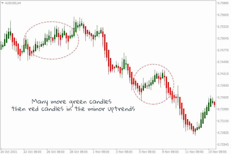
As you may notice, the Heikin Ashi has more smoothness when compared with the normal chart.
Trend Visualization
It is easier to visualize the trends with the Heikin Ashi because of its smoothness. This is not a luxury the Japanese chart can offer you.
Display
Another difference is the way the price data is displayed for both charts. The normal candles open at the opening price of the current period. Heikin Ashi, on the other hand, appears to open in the middle of the previous candle because of the way it is calculated.
Uses
Since they have different candlestick calculations, the way you would use one is different from how you would use the other.
For instance, the Heikin Ashi is a powerful tool in the hands of the swing trader, as it allows them to visualize the trend and get into positions easily. But it may not be as valuable in the hands of a day trader because it doesn’t give precise price data.
On the other hand, the normal chart is handy for the day trader because they can easily mark out precise entry, exit, and other crucial points using the candlestick.
Also, candlestick patterns and chart patterns work better on Japanese charts than on Heikin Ashi charts.
Conclusion
There you have it — the beauty of the Heikin Ashi chart. But while you’re here, check out how the normal candlestick chart differs from other chart types.